Inflation Deflation
Inflation is a confusing topic lately. Oil and commodity prices have been climbing dramatically for several years and housing has skyrocketed in price since the late 1990s, and yet this week saw the release of a number of reports that suggest inflation may be moderating.
Inflation, simply put, is an economic condition in which prices are rising undesirably fast. The most dramatic recent occurrence of inflation came in Germany in the early 1920s when prices doubled almost daily and it took a literal wheelbarrow full of money to buy groceries. This was known as “hyperinflation”. Recently in the United States inflation reached 27% in 1864, 17% in 1918, 14.4% per year in 1947, and 13% per year in 1979. You can see from the shrinking of these numbers that inflation has been reaching lower peaks in more recent years in the US as the economic system slowly learns its lessons.
Technically speaking even 1% price increases per year is “inflation”, although most people consider 3-4% “normal” in present economic conditions. Most central banks try to keep inflation at a small positive number because of the disastrous effects of deflation, or price declines.
The challenge faced by central banks is that inflation does not occur across the entire economy. Different sectors experience different amounts of inflation and deflation at the same time. If the central bank damps out inflation while some industries are already seeing deflation those industries will be impacted very harshly, losing money and in many cases experiencing waves of bankruptcies. This is one of the reasons that central banks tolerate inflation: the desire not to push too many industries into deflation. The central bank frequently has to pick winners and losers in order to manage the overall economy.
So what has inflation looked like if we split it up by industry? Here are selected inflation data for the 9 months Nov. 2005 to July 2006 (that last data was released today).
All of this puts the Federal Reserve Bank in a tough position. Energy is still rising fast but other industries are starting to experience deflation. Any further interest rate increases would push back against energy prices, but other industries might suffer because of it.
Why do we care? Why go through all this boring analysis?
Back in May I mentioned doing analysis on Oxford Shirts [OXM]. The Wall Street Journal “Smartmoney Screen” had identified it using an “upside surprise screen” but two of the previous 5 months of inflation data had shown deflation in the apparel industry. Fortunately we didn’t buy; OXM was 48.62 back then and closed today at 40.90 for a 16% loss since we decided not to buy. Sometimes the important stock calls are the things you don’t buy.
Inflation data helps you to identify winning and losing industries. This is one of the fundamentals that sector investing is based on. Industries experiencing inflation are seeing raising prices faster than general economic inflation, which is good for the business.
So what does the current situation tell us? Apparel is clearly the weakest sector. Other sectors with inflation above the average include transportation, medical care, and energy. (I’m leaving out some sectors that don’t translate well to investing.) The strong showing for transportation inflation is probably the reason Finance Wonk Portfolio Stock FedEx jumped up more than 4% today [FDX].
Sectors to watch out for include food & beverages, apparel, and recreation. You will notice a lack of those companies in the Finance Wonk Portfolio.
The analysis is actually pretty easily done on a regular basis. While I have a fancy chart here you can just go the Bureau of Labor Statistics (http://www.bls.gov/) and look at CPI data. The reports give sums and background data, although not quite as much as I’m using. Go to the CPI data now and look at the right hand columns and you'll see I've tricked you. This data is available easily, but I wanted to explain our way to it so it would make more sense. (Come back here when you're done!).
Add this tool to your repertoire! It won’t exactly impress people at parties but it may make you a bunch of boring money.
Invest well,
FW
Inflation, simply put, is an economic condition in which prices are rising undesirably fast. The most dramatic recent occurrence of inflation came in Germany in the early 1920s when prices doubled almost daily and it took a literal wheelbarrow full of money to buy groceries. This was known as “hyperinflation”. Recently in the United States inflation reached 27% in 1864, 17% in 1918, 14.4% per year in 1947, and 13% per year in 1979. You can see from the shrinking of these numbers that inflation has been reaching lower peaks in more recent years in the US as the economic system slowly learns its lessons.
Technically speaking even 1% price increases per year is “inflation”, although most people consider 3-4% “normal” in present economic conditions. Most central banks try to keep inflation at a small positive number because of the disastrous effects of deflation, or price declines.
The challenge faced by central banks is that inflation does not occur across the entire economy. Different sectors experience different amounts of inflation and deflation at the same time. If the central bank damps out inflation while some industries are already seeing deflation those industries will be impacted very harshly, losing money and in many cases experiencing waves of bankruptcies. This is one of the reasons that central banks tolerate inflation: the desire not to push too many industries into deflation. The central bank frequently has to pick winners and losers in order to manage the overall economy.
So what has inflation looked like if we split it up by industry? Here are selected inflation data for the 9 months Nov. 2005 to July 2006 (that last data was released today).
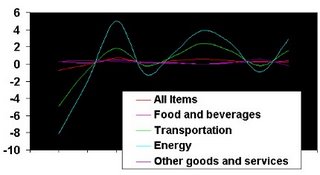
The last 9 months of Consumer Price Index data split up to show how different industries are faring. (Data is from Bureau of Labor Statistics, analysis by the Finance Wonk.)
You can see that the energy and transportation lines dominate the data. Those numbers have recently had much higher inflation than other sectors and when they dip below zero it isn’t enough to erase previous price increases. The commonly watched number is the “all items” category, which has been tame. The July numbers released today, for example, shows that the “all items” category went up only 0.4%. Within that number energy is up 2.9% (for the month) while apparel had inflation of -1.2% (yes, that’s deflation). The sum of inflation for apparel over the last 9 months of data is -0.3%, so apparel deflation is real.All of this puts the Federal Reserve Bank in a tough position. Energy is still rising fast but other industries are starting to experience deflation. Any further interest rate increases would push back against energy prices, but other industries might suffer because of it.
Why do we care? Why go through all this boring analysis?
Back in May I mentioned doing analysis on Oxford Shirts [OXM]. The Wall Street Journal “Smartmoney Screen” had identified it using an “upside surprise screen” but two of the previous 5 months of inflation data had shown deflation in the apparel industry. Fortunately we didn’t buy; OXM was 48.62 back then and closed today at 40.90 for a 16% loss since we decided not to buy. Sometimes the important stock calls are the things you don’t buy.
Inflation data helps you to identify winning and losing industries. This is one of the fundamentals that sector investing is based on. Industries experiencing inflation are seeing raising prices faster than general economic inflation, which is good for the business.
So what does the current situation tell us? Apparel is clearly the weakest sector. Other sectors with inflation above the average include transportation, medical care, and energy. (I’m leaving out some sectors that don’t translate well to investing.) The strong showing for transportation inflation is probably the reason Finance Wonk Portfolio Stock FedEx jumped up more than 4% today [FDX].
Sectors to watch out for include food & beverages, apparel, and recreation. You will notice a lack of those companies in the Finance Wonk Portfolio.
The analysis is actually pretty easily done on a regular basis. While I have a fancy chart here you can just go the Bureau of Labor Statistics (http://www.bls.gov/) and look at CPI data. The reports give sums and background data, although not quite as much as I’m using. Go to the CPI data now and look at the right hand columns and you'll see I've tricked you. This data is available easily, but I wanted to explain our way to it so it would make more sense. (Come back here when you're done!).
Add this tool to your repertoire! It won’t exactly impress people at parties but it may make you a bunch of boring money.
Invest well,
FW
posted by FinanceWonk at 5:30 PM
![]()
![]()

0 Comments:
Post a Comment
<< Home